Here is a Powerpoint explaining the new technologies that we used in the process of making our music video:
Jason Adorsu Music Video Blog
Wednesday, 16 March 2011
EVALUATION - Q.4) HOW DID YOU USE NEW MEDIA TECHNOLOGIES IN THE CONSTRUCTION & RESEARCH, PLANNING AND EVALAUTION STAGES?
Here is a Powerpoint explaining the new technologies that we used in the process of making our music video:
Monday, 14 March 2011
EVALUATION - Q.3) WHAT HAVE YOU LEARNT FROM YOUR AUDIENCE FEEDBACK?


Through face-book we managed to have a mixture of criticism for the music video. This was good as it aloud us to change what our audience did not like and helped us to learn what people would like in a music video. e.g for a video to be fun and exciting rather than unclear and boring.

HERE IS A SCREEN SHOT OF THE BAD COMMENTS FROM FACEBOOK:
 We wanted to get as much feedback to improve our video aswell as acknowlege the what people thought of our music video. I think the way that we can improve our music video is if we made the storyline a bit more clear and possibly used more locations outlining the chemistry more clear with the main boy and girl so people wouldnt be confused who has the crush on the main boy. That was common point that was raised in the process of completing our audience feedback.
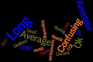
We have a WORDLE and a video of our audience giving us feeback with a few questions we asked of them.
GOOD WORDLE:
 Here are Some Good wordles and some bad ones
BAD WORDLE:
 Here is the audience Feedback Video that Joao and I produced:
Friday, 11 March 2011
EVALUATION - Q.2) HOW EFFECTIVE IS THE COMBINATION OF YOUR MAIN PRODUCT & ANCILLARY TEXTS( DVD DIGIPACK, MAGAZINE ADVERT)?
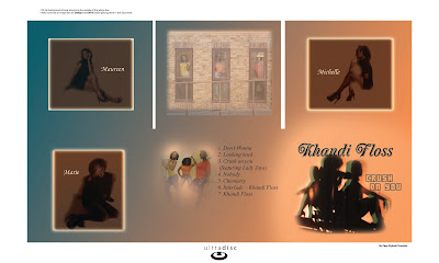
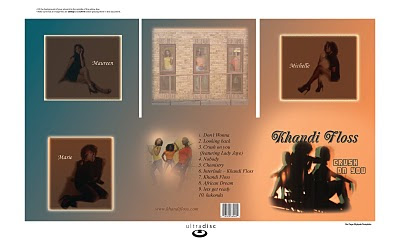
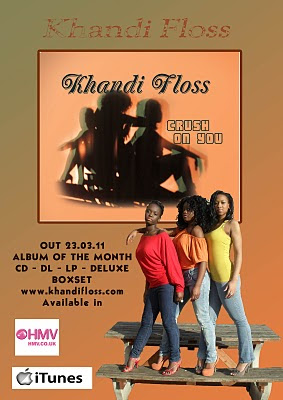
We used Photoshop which helped us design the digipack and the advert/magazine to a professional standard .This shows that we were able to stick to the whole glamorous and colourful theme through pictures as well as our music video. The digipack and magazine steps and progress are shown below.
PROGRESS 1
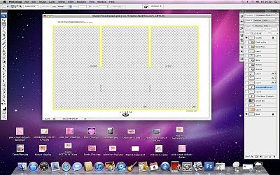
PROGRESS 2
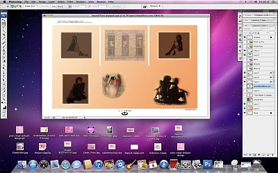 PROGRESS 3
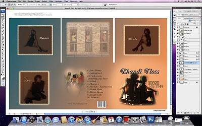 PROGRESS 4 FINISHED DIGIPACK
 I am now going to show the progress of making the magazine to the finshed product:
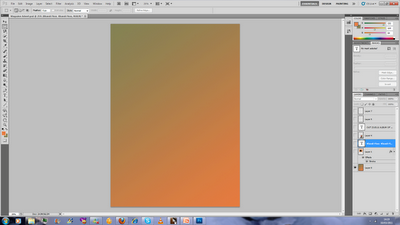 PROGRESS 2
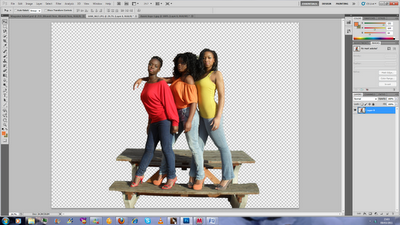 PROGRESS 3
  PROGRESS 4
Monday, 7 March 2011
EVALUATION - Q.1) IN WHAT WAY DOES YOUR MEDIA PRODUCT USE, DEVELOP OR CHALLENGE FORMS & CONVENTIONS OF REAL MEDIA PRODUCTS
Firstly, we used different locations in our music video. This was done in order for our video to not be to seen as boring as that would be the case if it was done in one location. Therefore, after a lot of planning we decided to shoot our music video in various significant areas aswell as in the school. Outside school we managed to film around Buckingham Palace, St. James Park andThe Millenium bridge which was a gret experience as we got to film in the heart of londons most famous and influentional landmarks and locations.
 Our second outside location was the millenium Bridge. Which was again a great experience here we had the dance scene of the girls singing the chorus. A lot of lip syncing was shown in this part of the video which I feel was done in a succesfully. This was a great choice for the music video as it showed the attractive image we wanted to portay with the attractive girls and attractive location. Here is two pictures of the locations:
 Our last location that was used Outside school when we filmed around Buckingham Palace. We chose this location because we wanted to demonstrate our creativity and knowledge.
Firstly we filmed at Buckingham Palace as we believed that it was prestigious location that has a lot of significance to the country, since it’s where our Queen lives. Therefore thats one of the location where we wanted Khandi Floss to perform that last dance as it would follow the glamorous look as it’s also a glamorous location.

Furthermore, we also used lip syncing throughout the song and a lot of dancing. We had to make sure that all the lip syncing was in sync , otherwise it would of looked out of place which why we had to make sure that the final cut express editing was on point. The constant dance scenes and acting made the whole music video a lot of fun and very instresting to watch.
This music video was a challenge for us as we had to battle against the weather alot and with the cast of the video. People being Avalaible was hard at first but then we got it together in the end. When we first picked the song we had to listen out for the lyrics to think about ideas, Luckly for us the main girl that stared in the music video was part of the original KHANDI FLOSS group so we had an easier interpretation of how we wanted to do things in the video. Picking a storyline for the music video was not a problem because the title said it all CRUSH ON YOU", so we decided to take it Pop/RnB style as that was the genre of the song and keep the storyline solid and complete.
After Filming and editing our music video I came to realise that the storyline was stronger as we got to exercise in the video what was said in the song. The original song never had a video so we made our own video for the song showing the journey of the music video. E.g. from the main girl having a crush to the end where she finally gets the main boy. I believe there was a lot of transcations and different editing styles e.g. fades and disolves which fall into the special effect category which helped make the music video very insteresting to watch and memorable.
Saturday, 5 March 2011
EVALUATION
Tuesday, 1 March 2011
Friday, 25 February 2011
Completed Digipack
