I feel the combination of our main product and ancillary text i.e. DVD Digipack and Magazine cover was very effective. I say this because our music video matches our magazine advert and DVD pack, creating the glamorous image we wanted to portray. Just the way our music video is colorful, glamorous and aswell as having alot of dancing, we tried to do a similar pattern with our advert and DVD pack. Making the girls look like strong characters that we see them as in the video. We got the girls to pose in the magazine as the strong sexy indivuals that we wanted to portay them as.
We used Photoshop which helped us design the digipack and the advert/magazine to a professional standard .This shows that we were able to stick to the whole glamorous and colourful theme through pictures as well as our music video. The digipack and magazine steps and progress are shown below.
We used Photoshop which helped us design the digipack and the advert/magazine to a professional standard .This shows that we were able to stick to the whole glamorous and colourful theme through pictures as well as our music video. The digipack and magazine steps and progress are shown below.
Here is the Progress of the Digipack to the finished DIGIPACK:
PROGRESS 1
PROGRESS 1
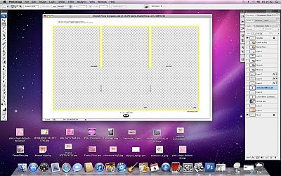
PROGRESS 2
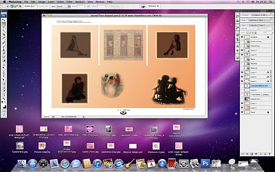 PROGRESS 3
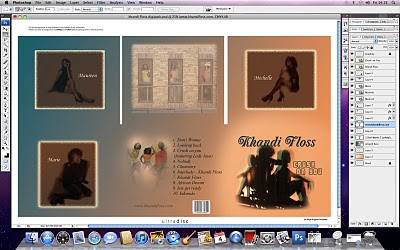 PROGRESS 4 FINISHED DIGIPACK
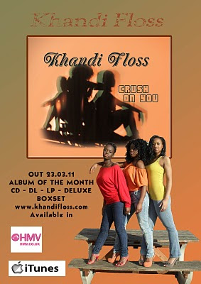
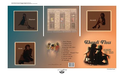 I am now going to show the progress of making the magazine to the finshed product:
PROGRESS 1
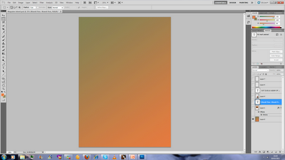 PROGRESS 2
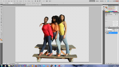 PROGRESS 3
  PROGRESS 4
PROGRESS 5 FINISHED MAGAZINE

No comments:
Post a Comment